
Wednesday, October 24, 2012
Classy
Thursday, October 18, 2012
Bike

This ad has a very powerful message in my opinion because when I was in New York it was crazy. Cars and pedestrians don't pay any attention to each other and this ad shows that. I think it is very effective to have the painting of the bike symbol on the car like that car just hit the person on the bike.
Wednesday, October 10, 2012
Eggshell
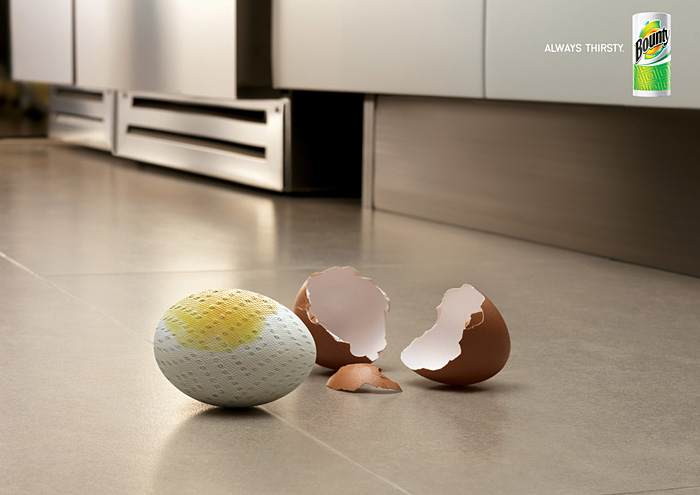 This one is really interesting because when you think of Bounty you don't typically think about it being an odd shape such as an egg. This piece does look very balanced it doesn't feel too heavy toward the bottom and it looks very unified with the repeating shapes of the broken egg shell and the egg paper towel thing really hold it together.
 Law and Order
 This one really caught my attention because it is a 3D billboard. I have never seen anything like this and I think it is extremely creative. Bringing in some ideas from class...this looks very balanced and unified as an advertisement and it catches the audiences eye very well.
Funny Watch
 Here's yet another ad that caught my eye. This one in particular because I was recently looking for a watch to buy for my boyfriend. This ad just made me laugh because the strap says "Try it here, the big pilot's watch." I believe that word is pilot's I'm not positive. But anyway this ad just really made me laugh so I thought I would share it.
 Sunday, October 7, 2012
Palm

To start this post I want to apologize for all of the random ads. These are the only things that I can think of to do for my blog posts so there will be a few more following this one. Alright, so this ad struck me as interesting because I tend to write on my hands a lot. I saw that in the ad and was instantly curious to find out what it was about. I love the simplicity of the two words at the top too. "Chaos" and "Order" work really well along with the backgrounds of their sides. The left is very claustrophobic and the right is very neat and organized.
Music

This picture truly caught my eye because it was so weird. I didn't understand it at first because I wasn't sure why there was a tiny person in that guys ear. I finally got that it was supposed to be a headphone and the small person was Elvis Presley because that is what the guy was listening to. This ad is extremely clever in my opinion because it is out of the ordinary and people will take a second look at it.
Thursday, October 4, 2012
Coffee!
 This image for some reason made me think of our Graphic Design class. I think because it looks like something that a Graphic Designer would like to work with for and ad for a coffee shop. It is very homey and it gives you a sense of warmth when you look at it.
Subscribe to:
Comments (Atom)